
In the 1966 animated short film Chromophobia by the Belgian filmmaker, animator and comics artist, Raoul Servais, an army of grim-looking soldiers arrive in a town and strip it off of all colours, turning it into a black and white place. Multi-coloured flags are shot down and replaced with black and white ones with the symbols of skulls and bones. Balloons are burst and replaced with black bats. A cock turns into a raven. People in their colourful clothes are dressed up in black and white striped garb reminding one of prisoners. This chromophobic army lands with parachutes on the top of cathedrals blackening their rooftops. Stained glass turn into cobwebs with spiders. But it is a happy ending and peace, in the form of a white flag and brightly coloured balloons finally arrive.
A similar army, in the form of thoughts and ideas, descended upon the once-colourfully painted Western historical artworks and architecture such as the ancient Greek and Roman statues and the cathedrals of Europe over time, stripping them of colour, except mostly black and white.
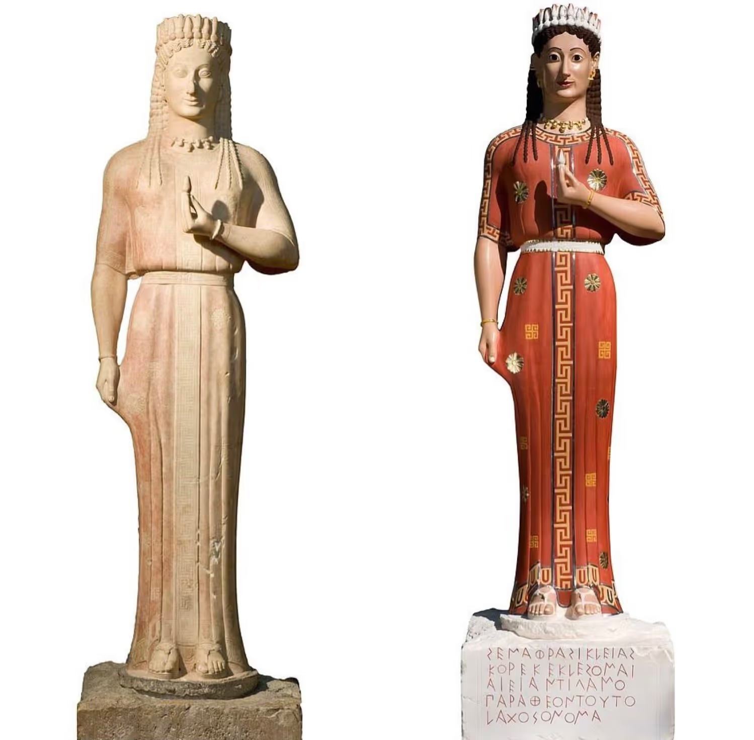
This purging of or prejudice against colour has been termed as ‘chromophobia’ (literally, fear of colours) by the Scottish writer and artist, David Batchelor, and it has had a long history in Western culture, indicating, first of all, to its subjectivity.
Colour is a perception. But colour is also an interpretation. When the poet and artist, Joanna Fragoulis describes colours to her blind friend in one of her poems, red assumes the emotions of both anger and love. Blue is coolness, calm and sleep. Her friend sometimes smells of pink as does the sky smell of green after it has rained.
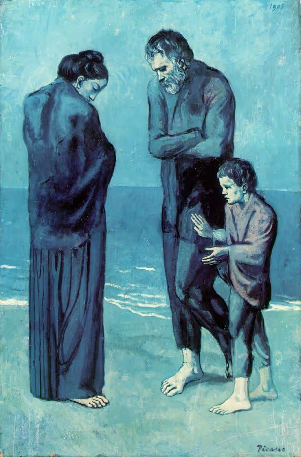
This emotional and expressive power of color had been intensified by the efforts of the Fauvists who “distorted” colours by assigning them the “wrong” objects. André Derain’s Charing Cross Bridge, London (1906), is a riot of colours with a pink-yellow sky, distant buildings in green and the yellow river Thames. Picasso’s Poor People on the Shore (1903) is rendered completely in different hues of blue.
So, associated with emotions, rather than reason, colour furthers suspicions about its unreliability. Colour is in the eye of the beholder, as the hierarchization of it is in the mind of the beholder.
In this hierarchy, white and black seem to feature at the top tier and only when in confinement and isolation from other colours. Only a “voluntary poverty” of other colours can render them their position of significance. In this “voluntary poverty” of other colours, white is more than the colour. Rather, whiteness, as against other colours, is clean, pure, moral and rational. Similarly, black symbolizes sophistication, self-control and power.
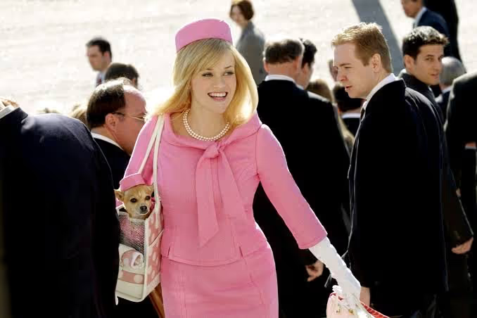
As against this, one reviled colour is pink and particularly its vibrant, bubblegum versions. When the protagonist of Legally Blonde (2001), Elle Woods, enters Harvard, she is discredited solely because of her signature colour by her batchmates at Harvard, clad in greys, blacks and browns. Black and white are also colours but pink, traditionally associated with femininity is not taken as seriously and is considered to be frivolous. The French painter Jean Auguste Dominique Ingres had this to say of colour: “Colour enhances a painting, but she is only a lady, because all she does is to make still more attractive the true perfections of art.” Such kind of colours, therefore, are an after-thought. So colours, unless they are black or white and their near counterparts, usually linked with the feminine, as opposed to the masculine, are inessential and graded lower in the scale of significance and desirability.
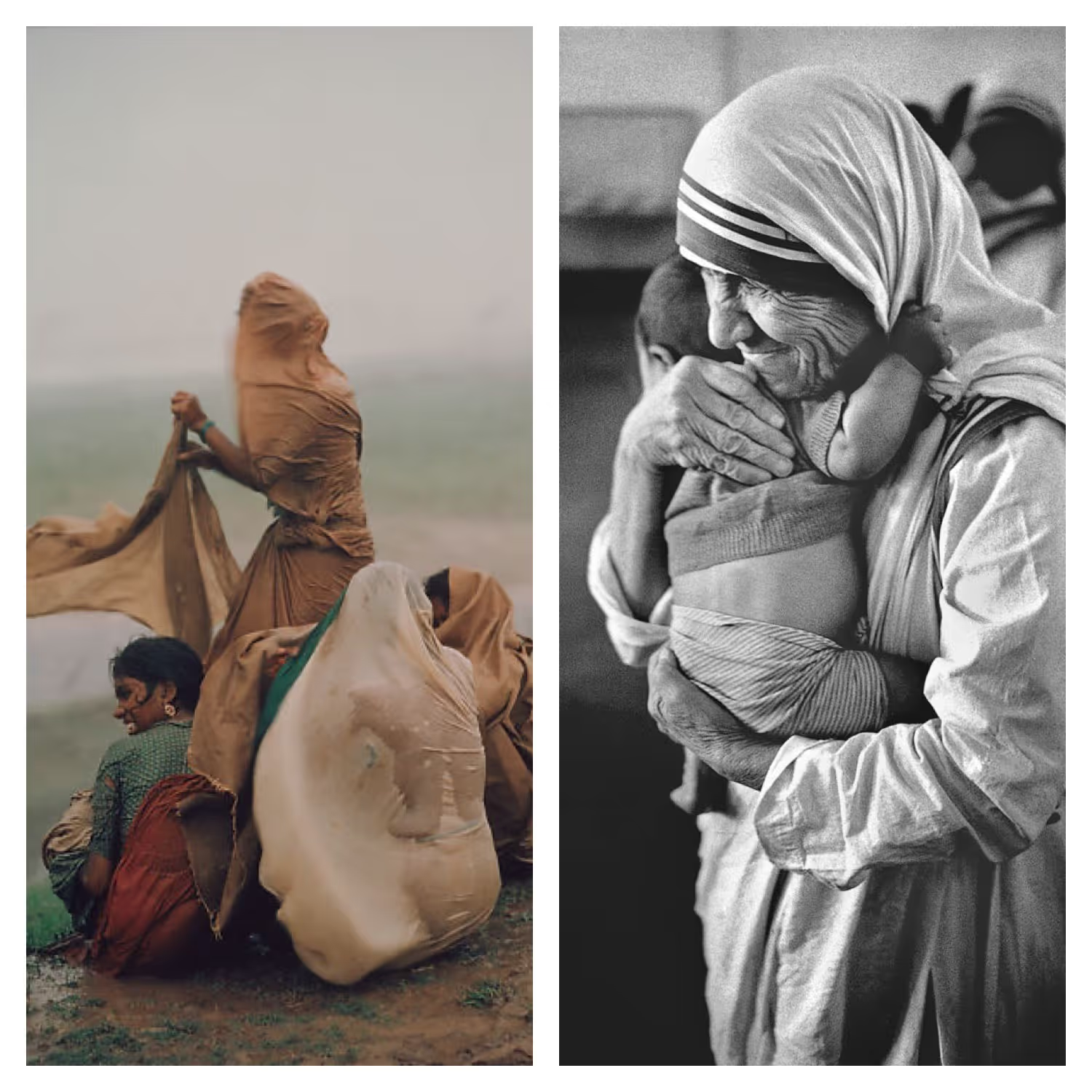
In this way, colours and aesthetic practices which they are a component of, act as both a reflection of and influence on culture. And yet we often find differing and contrasting takes on colours within the same culture. Raghubir Singh, a pioneer of colour street photography in India, called colours a “blessing that is written into the Indian idea of darshan- sacred sight- which we have known since childhood.” But while according to Singh, colours are an intrinsic part of the Indian cultural ethos and black did not quite fit his idea of darshan, according to photographer Raghu Rai, certain situations look well in black and white which even “silences the noise of colours”.
Here the concept of gaze, or how a particular person looks at the subject of art, comes into play and it is also this gaze that affects their use or lack of colours. The making of films completely or mainly without colours has risen in recent times. As the British actor and director Kenneth Branagh says, even the colours black and white are not completely devoid of emotions and a poetic quality. Branagh’s movie Belfast (2021) which also won the Oscar for Best Original Screenplay this year was shot entirely in black and white. Of the chosen coloured medium, Belfast had to say that “...black and white allows you to feel people” and “makes for a poetic dimension to things that can otherwise seem a little banal.” Similarly, director Mike Mills of C’mon C’mon (2021) disagrees that black and white is less emotional. He says, “I found intimacy in (using) black and white.”

And yet Mills seems to agree with the notion that colour is to be relegated to the realm of the superficial, the supplementary, the inessential or the cosmetic, and that its mere utility is supposedly purely decorative, and therefore it can be done away with. This tradition places drawing or design in opposition to colours or colouring-in. Mills says that black and white is “a drawing, not a painting... There’s something very immediate and quick and unfussy and unfettered about a drawing...” The cinematographer of Belfast, Haris Zambarloukous, calls colours “distractions.”
Ironically, even though colours have been suspected of being synthetic and distracting, black and white may be used to for this very same quality in them in films. Movie makers shoot in black and white to remove the film from real life, “to bring theatricality, and lose temporality”, as said by cinematographer Bruno Delbonnel of The Tragedy of Macbeth (2021).
The importance of colour over that of design even though both of them are necessary to reproduce art is also found in the opinion of the critic, colour theorist and sometime Director of the Arts in the 1848 Socialist government in France, Charles Blanc. To him, line figured above colour, and there are only a few ways to avoid falling down to this lowliness of the resource called colour: control or subordinate it.
The purging of colour is usually accomplished in one of two ways. In the first, colour is made out to be the property of some ‘foreign’ body- usually the feminine, the oriental, the primitive, the infantile, the vulgar, the queer or the pathological. In the second, colour is relegated to the realm of the superficial, the supplementary, or the cosmetic. Either way, colour is routinely excluded from the higher concerns of the Mind, a result of a “moral puritanism and aesthetic austerity,” according to the French philosopher, art historian and professor of aesthetics, Jacqueline Lichtenstein. In this way, if colours are symbols so is the active exclusion or poverty of it.
But why did this particular distaste for and prejudice against colour evolve to its enormity particularly in the West and in colonized societies? I have three speculations: one related to drugs- something the ancients Plato and Aristotle themselves associated colour with, the second related to the challenges to our ideas of vision and limitations of the human language, and the third related to racist ideas about colour.
The meaning of the word ‘colour’ has always sounded a little like drugs. The Latin colorem is related to celare which means to hide or to conceal. In Middle English, ‘to colour’ is to decorate, to beautify, to design and to misrepresent. In both cases, it means something less-than-true, something which drugs also induce. Aristotle called colour a drug- pharmakon. For Plato, a painter was merely “a grinder and mixer of multi-colour drugs.” Many hallucinogens and drugs, like mescaline and ecstasy, not only distort and intensify forms but also colours for the takers of these drugs. For the English writer Aldous Huxley, this state of heightened colours was one of “not-Self” or in other words, disorientation, loss of consciousness and loss of touch from what we see as reality. The Greek philosophers may have arrived at their conclusions from the reports of people who had been users of such drugs, or even from their direct use of such psychedelics- something that can only be guessed.
But then, what about this reality? For many colourblind people, the “real world” is coloured quite differently than others, challenging ideas about an “objective reality”. This indicates once again that colour, after all, is a perception and sight is a spectrum. Not only does colour challenge our ideas but it can also expose the limits of our language. “We think of red as a hot colour, but we think of grey as a cold colour. Why can’t we imagine a grey hot?” asks David Batchelor. At the risk of sounding far-fetched and flighty, the possibility of millions of people perceiving millions of gradations of colour differently and yet not having a perfect language for colour might have encouraged distrust against colour. As ever-present as colour is, it is also elusive.
The discrimination against colour does not only take artistic or technical forms but also moral, racial, sexual and social. Black escapes censure only as long as it is the colour of an object and not of a person. For the architect Le Corbusier, colour was “suited to simple races, peasants and savages.” Black-skinned women in history and mythology, such as Andromeda- the princess in Greek mythology, and Queen Sheba from the Old Testament, were whitewashed in Western art and movies. Although it is not known for certain how Jesus exactly looked like, the historical Jew from Galilee in Israel most probably did not have the European white skin and blue eyes he is depicted with in popular images that have proliferated across the world, mainly through trade and colonization. Man makes God in his own image or the way he perceives his own image. The Indian painter and artist, Raja Ravi Verma, despite not hailing from a world of fair women but definitely from colonial times, painted his women such as Damayanti and Shakuntala as fair. This, despite their literary and earlier versions describing them as dark-skinned. Even Blackface, the practice by non-Black people of painting their faces black or dark brown, is rooted in the mockery and dehumanization of Black people, and not in a desirability for the particular skin colour.

But regardless of the ‘why’ behind this chromophobia, we find that there is a cultural history and even a contemporaneity for the preference for black and white. Closer in time and personal experience, an Indian friend too seemed to have given in to this crusade for black and white. After he moved to Germany half a decade ago, he was teased by someone of becoming a “foreigner” because of the change in his wardrobe colours to majorly blacks, whites and neutrals. When the expat friend showed me pictures of his home in Germany, it acutely resembled the description of the white house David Batchelor begins his book Chromophobia with. Both seemed strategically emptied of colour, except white. Even the paper deer head which he himself crafted hangs on the wall in white. Although he has sent me pictures of it from all possible angles, it is not possible to make out if the animal is happy or grim in white. Perhaps, in this case, the colour white has really done its job as assigned by chromophobics- made something devoid of emotions.