.svg)


When people talk about IKEA, they usually talk about three things: price, flat packs, and the emotional journey of locating “Part A” at 10:47pm.
But there’s a quieter IKEA product most of us interact with first:
The manual.
It’s onboarding. It’s navigation. It’s error prevention. It’s a support experience that ships inside the box.
And it’s doing a surprisingly hard job: guiding millions of people, across languages, cultures, and skill levels - through a physical build without a human in the room.
Now granted - some IKEA manuals still trigger a small identity crisis.
But overall? They work. And there’s a reason.
This article breaks down the IKEA manual as a UX system: what it optimises for, how it reduces confusion, and what you can steal for your own product documentation (digital or physical).
Most instructions assume a shared context:
IKEA can’t assume any of that.
IKEA sells globally, and their own customer support guidance explains why the instructions rely heavily on visuals: global distribution demands instructions that are broadly accessible and easy to understand.
So the IKEA manual isn’t “documentation.” It’s a universal interface.
One thing to note is: the moment you treat an instruction sheet as an interface, you start judging it differently.
Not by how pretty it is.
By whether it helps users breeze through.
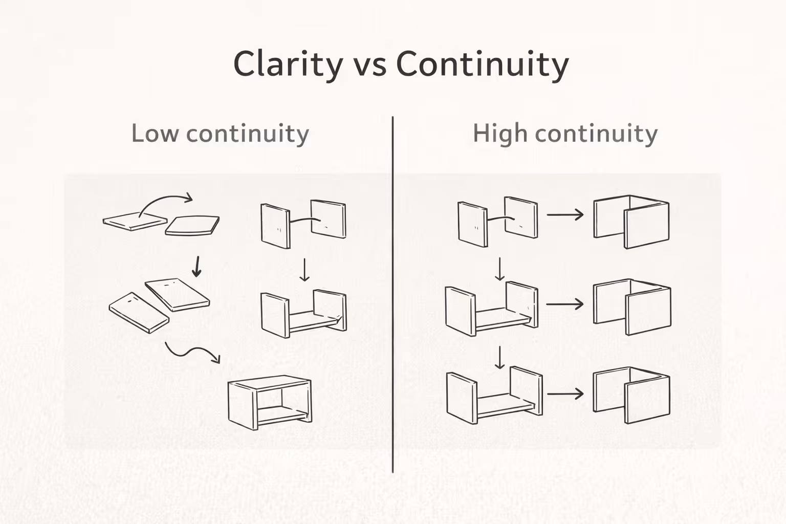
IKEA’s instruction designers have described two guiding principles that shape their manuals:
That second one matters more than people realise.
Because continuity reduces the number of new things a user has to learn while they’re already doing something unfamiliar. You’re not just building a chair, you’re also learning the “language” of the manual.
A good manual teaches you its grammar fast:
Once you learn the grammar, you stop translating. You start executing.
Simple, but effective.
Wordless (or mostly wordless) instructions aren’t a gimmick. They’re a scalability strategy.
Text introduces:
So IKEA leans on diagrams as a common language.
This is also why IKEA can host the same instructions as downloadable PDFs on product pages. The manual isn’t just “inside the box”-it’s part of an ongoing support system.
Steal this: If your product ships internationally (or even nationally), aim for “understandable at a glance” before you add paragraphs.
Good onboarding doesn’t dump everything on the user at once. It sequences effort.
IKEA manuals typically break the build into discrete steps where each step asks for one action: attach this, tighten that, flip the panel, repeat.
That’s not just tidy. It’s cognitive load management.
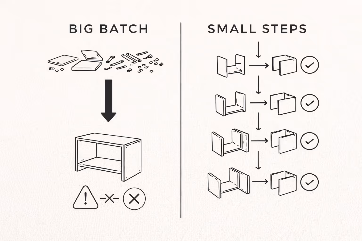
In UX research terms, humans have limited working memory. When a task forces users to hold too much information at once, performance suffers: they miss details, make mistakes, and abandon the task.
Chunking is IKEA saying:
“Don’t carry the whole wardrobe in your head. Carry this screw, this direction, this step.”
Steal this: Whether you’re writing setup instructions, onboarding screens, or an FAQ, present one task at a time. If users have to reread the same paragraph three times, the design is asking for too much mental effort.
The best manuals don’t test your memory. They reduce the need for it.
Instead of saying “orient the cam lock so the arrow points inward,” IKEA can show:
That’s “offloading” in UX terms: shifting work from recall to recognition. You shouldn’t have to remember what the last step meant- you should be able to see it.
Steal this: If a user must remember something to succeed, re-display it. Use visual references, repeated labels, or consistent positioning. Make the correct action obvious without forcing a mental replay.
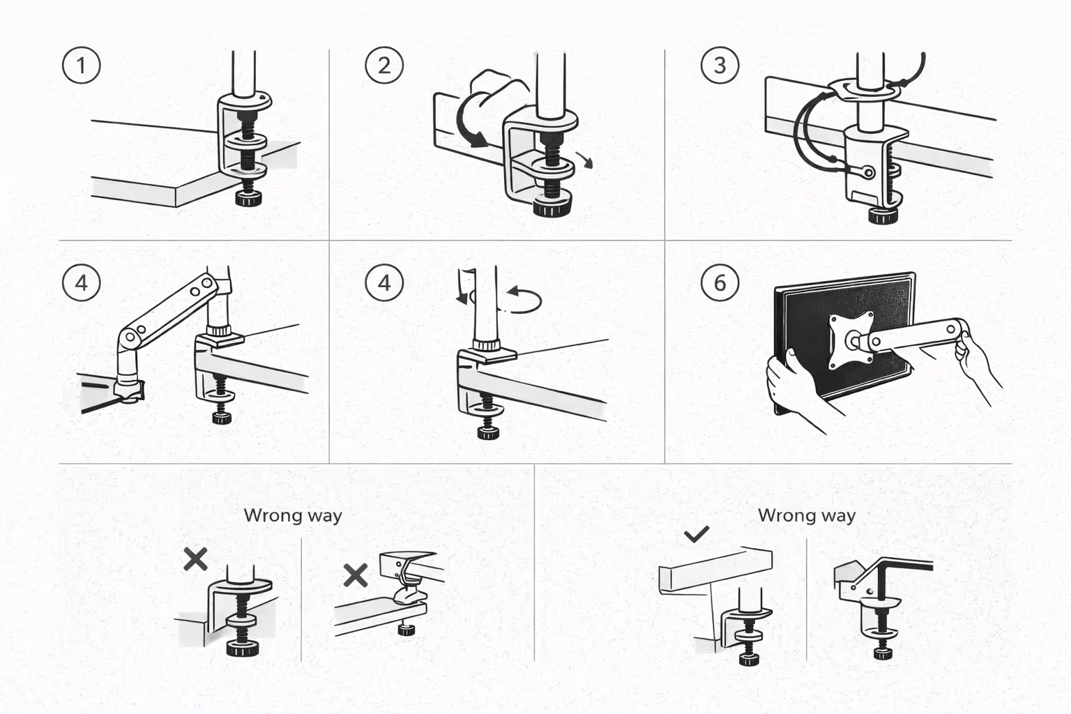
IKEA manuals often communicate “wrong” clearly:
This is quiet UX leadership. It’s cheaper to prevent an error than fix it later.
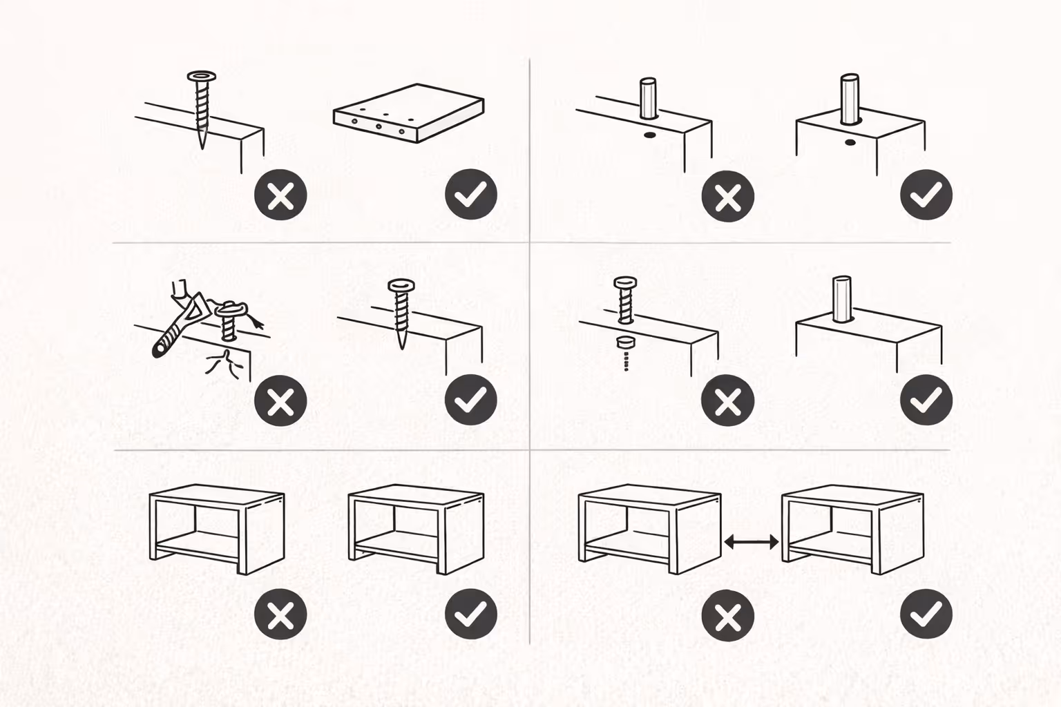
Because in physical assembly, “later” might mean:
So IKEA doesn’t only show the happy path. It shows common pitfalls.
Steal this: Document the top 5 mistakes users make- and design your guidance around preventing them. If you’re only writing the happy path, you’re leaving users alone at the exact moment they need you.
One of the more interesting details about IKEA manuals is how they’re produced: instruction designers use resources like construction drawings, 3D models, and videos of test assemblies -and the test assembly phase is treated as critical.
In other words: the instructions are validated against reality. Not just approved in a meeting.
That’s how you find the “gotcha” moments:
Now granted - no manual is perfect.
But I am saying: testing instructions with real builds is the difference between “seems clear” and “is clear.”
Steal this: Don’t just proofread your instructions. Put them in front of someone who hasn’t seen the product and watch where they hesitate.
Progress isn’t just a feeling. It’s a usability feature.
In many IKEA builds, you can see the object taking shape quickly. The manual’s step structure supports that: early steps create stable “wins” (frames, legs, main panels), and later steps refine (doors, shelves, final tightening).
This matters because confidence is a prerequisite for completion.
If a user doesn’t feel progress, they stop. If they don’t feel competent, they rush. If they don’t feel in control, they blame the product.
Steal this: Design your setup flow so users get early wins. Show progress clearly, and sequence steps so confidence builds with complexity.
There’s also psychology at play.
Research on what’s often called the “IKEA effect” suggests people can value products more when they’ve successfully put labor into creating or assembling them - and that successful completion is an important boundary condition. Effort that doesn’t lead to completion doesn’t reliably increase valuation.
This puts the manual in an interesting role.
The manual isn’t just helping you assemble furniture.
It’s helping you complete a project.
Completion creates:
So the manual is part of the customer experience and part of the perceived value.
Steal this: If your product asks users to do work (setup, configuration, migration), make completion feel achievable. The goal isn’t to remove effort entirely - it’s to make effort successful.
If you’ve ever stared at a diagram and thought, “I understand every symbol individually, but not this sentence,” you’re not alone.
Wordless systems can fail when:
This is the key lesson: minimalism is only helpful when meaning stays obvious.
So the better takeaway isn’t “remove all text.”
It’s “remove anything that doesn’t help people understand what to do next.”
Clarity before creativity. Then both.
Whether you’re documenting a product setup, writing a help centre article, or creating a physical quick-start guide, these are the principles to apply:
Make the process uncomplicated. Optimise the flow. Maintain absolute clarity.
The IKEA manual works because it treats instructions like UX:
It’s not perfect. But it’s a strong reminder that support experiences aren’t “extra.” They’re part of the product.
And when they’re done well, users don’t just finish the task.
They finish it thinking:
“Yep. I can do this.”