Busreisen Schmidt

(Industry)
Travel
(Website)
Runkel Reisen
(Services)
Branding
(Summary)

Two related brands. One clear tier story.

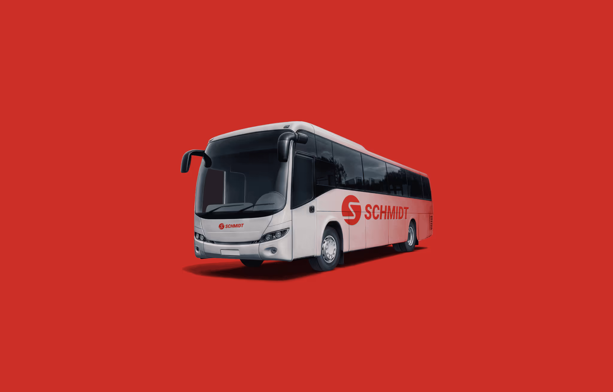
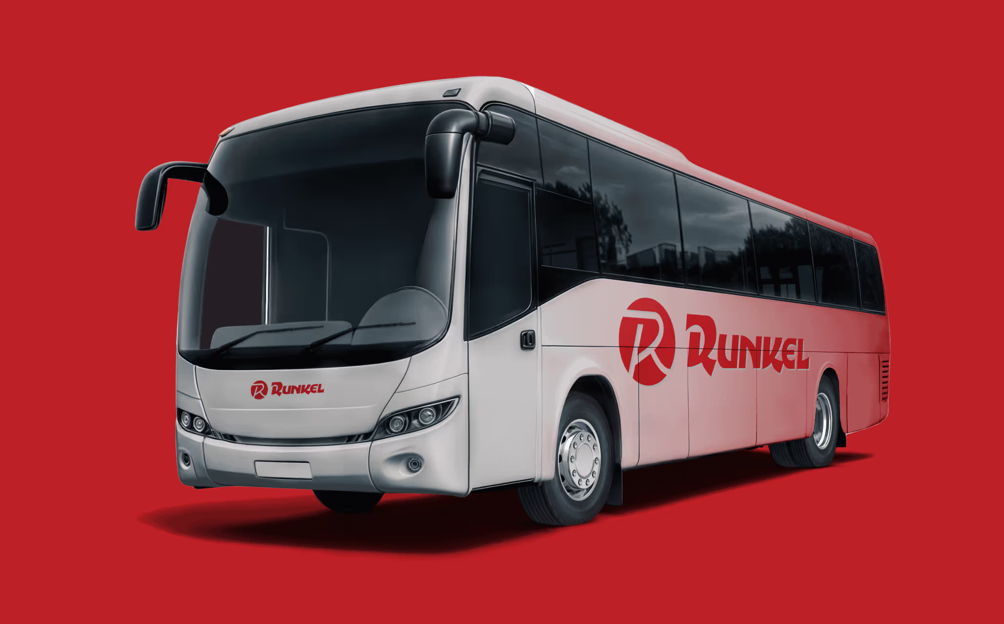
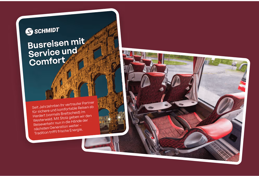
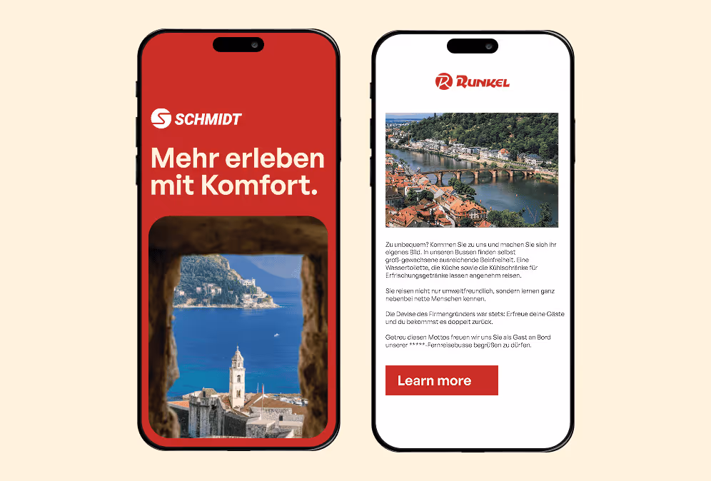
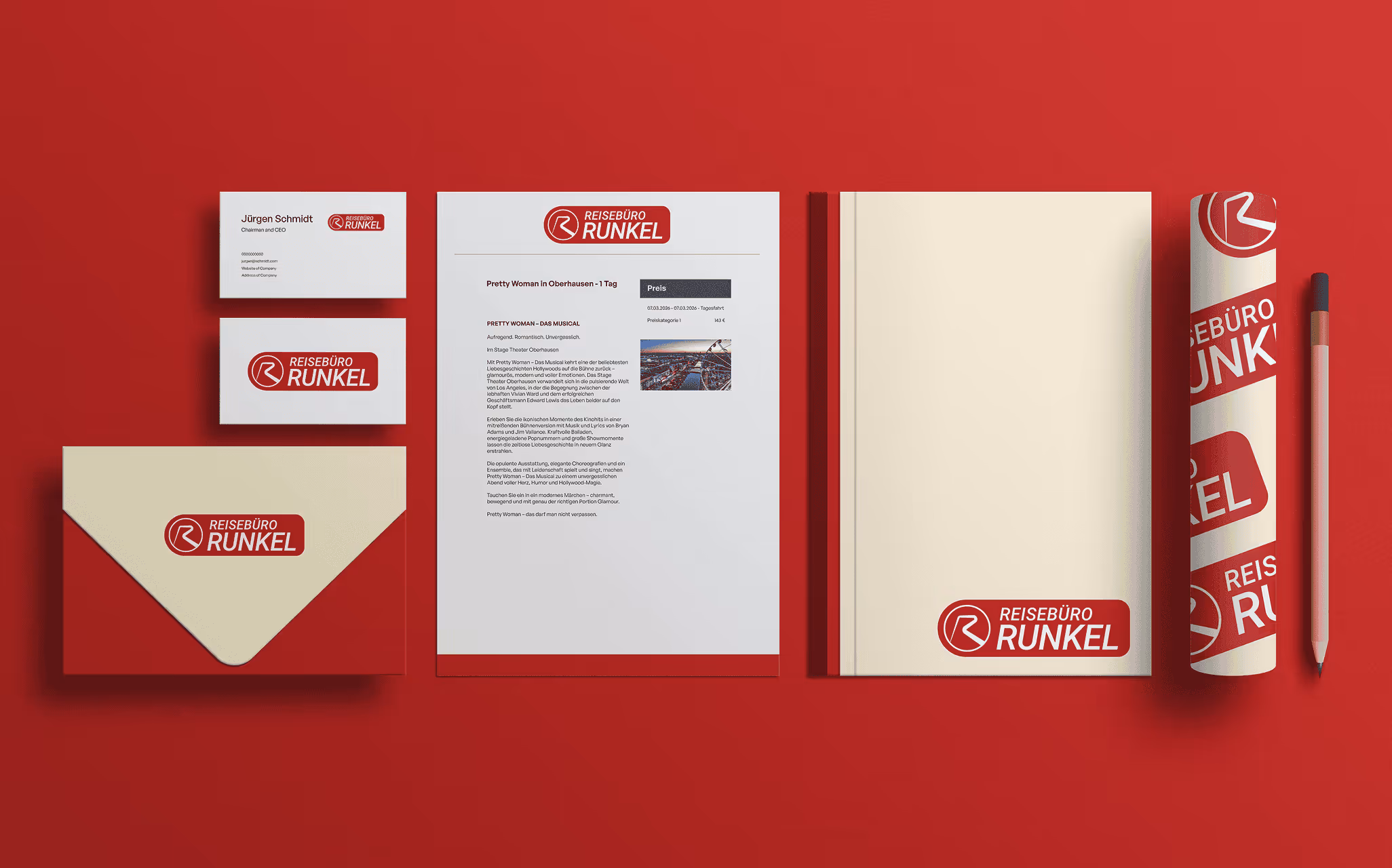
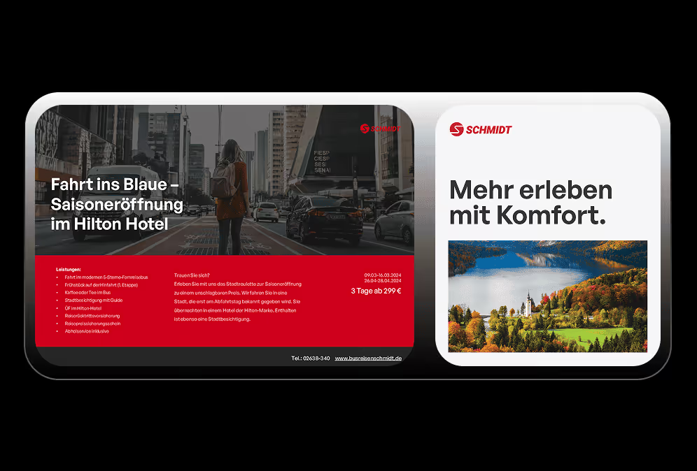
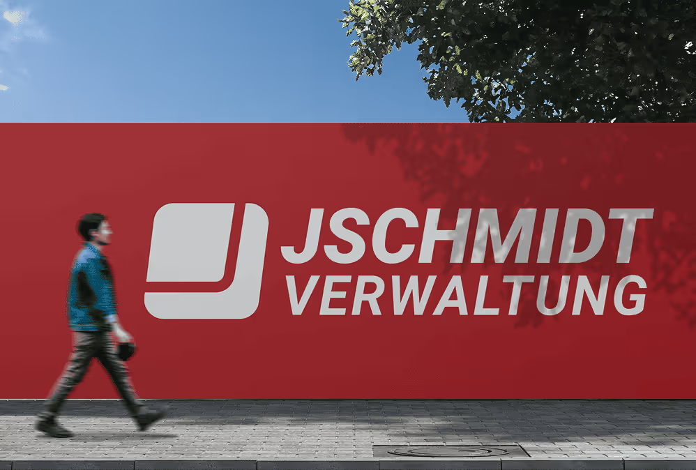
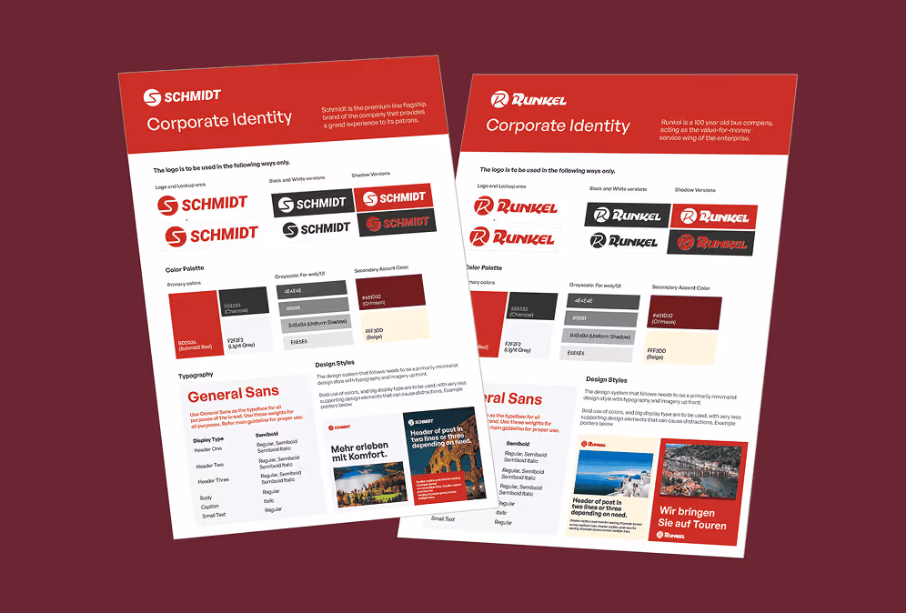
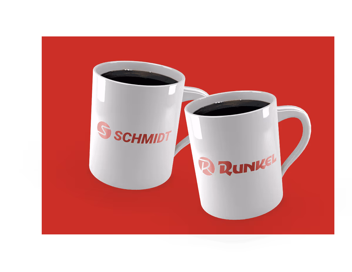
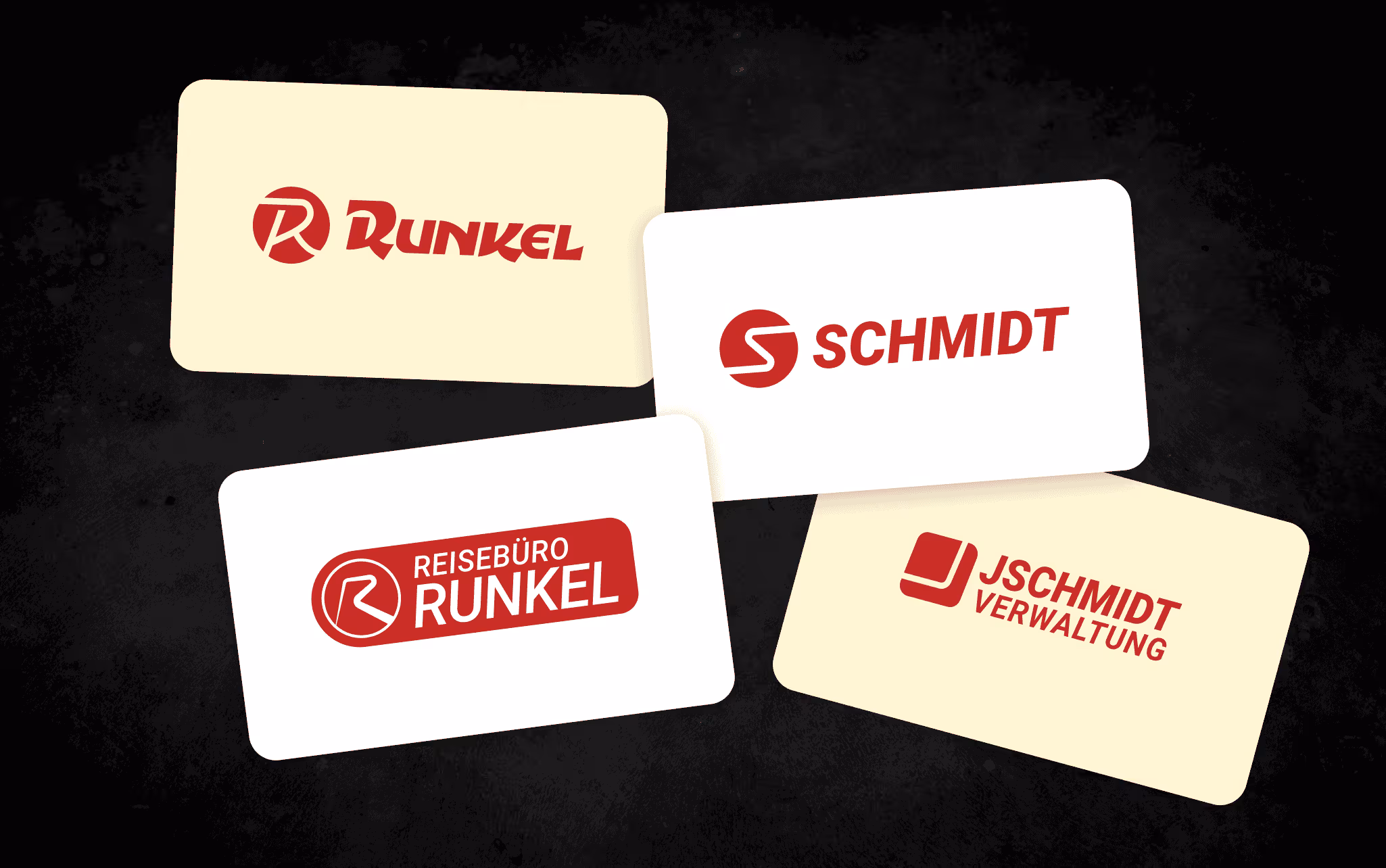
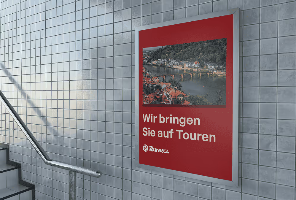
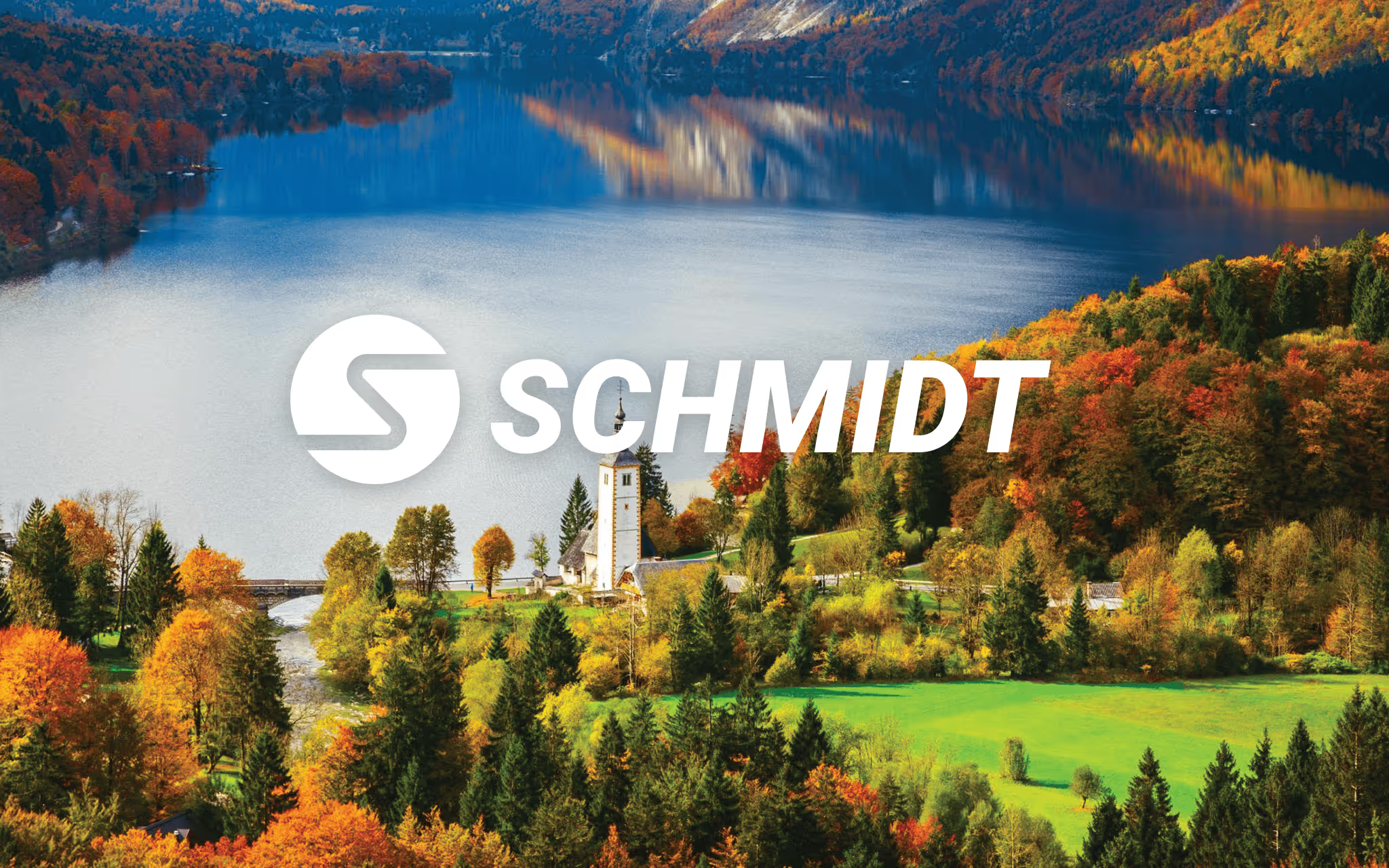
Busreisen Schmidt (est. 1956) and Runkel Reisen (est. 1928) came under shared ownership—while still serving two distinct travel tiers. The task wasn’t to flatten those differences. It was to celebrate both legacies and create a fresh, unified face across every touchpoint. We built a dual identity system that makes the choice obvious at a glance: premium comfort vs. smart value—with shared lineage, modern visuals, and consistent application from fleet graphics to social posts.

(WORk)
(Concept)

The challenge

They needed a refresh that could do three things at once:

  1. Modern look
    Create clean, lively visuals that match today’s travel expectations.
  2. Clear tier story
    Show immediately which brand is premium comfort and which is smart value.
  3. Seamless traveller journey
    Apply the refreshed look consistently across touchpoints—building instant recognition and trust.

The solution

Two fresh, related brands that clearly signal premium and standard tiers while still showing shared lineage.

We started with listening and alignment on what the brands needed to say—then translated that into a practical identity system designed for real-world rollout (vehicles, print, and promo templates included).

What we delivered

Instead of handing over a pile of assets, we delivered a usable identity system—and applied it immediately to the things the business needed to put in market.

  • Two logo suites with distinct personality, designed to sit together without looking like strangers.
  • Colour + typography systems for each brand, built to communicate the tier story quickly and consistently.
  • Photography and supporting imagery direction to keep the look cohesive across campaigns and everyday posts.
  • Fleet livery concepts and mock-ups prepared for real-world production (paint or vinyl), so the brands show up confidently on the road.
  • A collateral kit (stationery, brochures/flyers, banners) plus social templates geared for the August push—so the refresh wasn’t just conceptual, it was deployable.
  • A consolidated brand guidelines PDF (English) that sets clear usage rules and makes future rollouts easier.

Outcome

The end result is a dual-brand system that’s easy to recognise, easy to apply, and hard to dilute.

  • Travellers can quickly understand what each brand stands for—and choose accordingly.
  • The business gets a consistent visual toolkit across vehicles, print, and digital touchpoints.
  • Future materials can be created without “reinventing the brand” each time—because the rules are clear.

Next step

Want to unify multiple offerings without losing what makes each one distinct?
Contact us.

(WORk)
(MORE)

Check more work

Get in touch