(Industry)
Agriculture
(Website)
Farm Native
(Services)
Branding
,
Packaging
(Summary)

Brand + packaging designed as one system, so every product looks related, recognisable, and ready to expand.

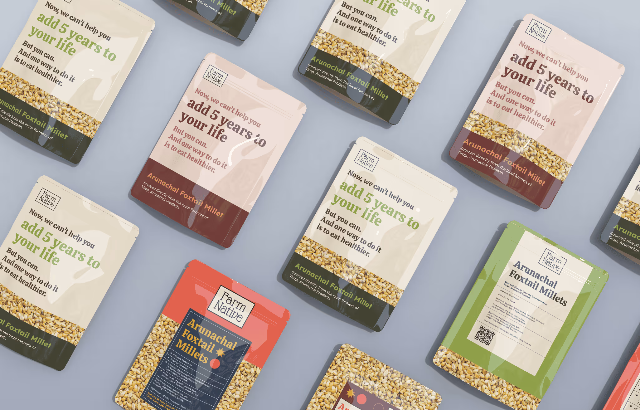
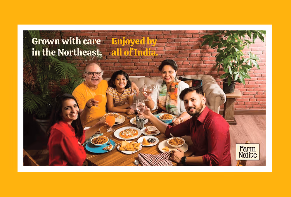
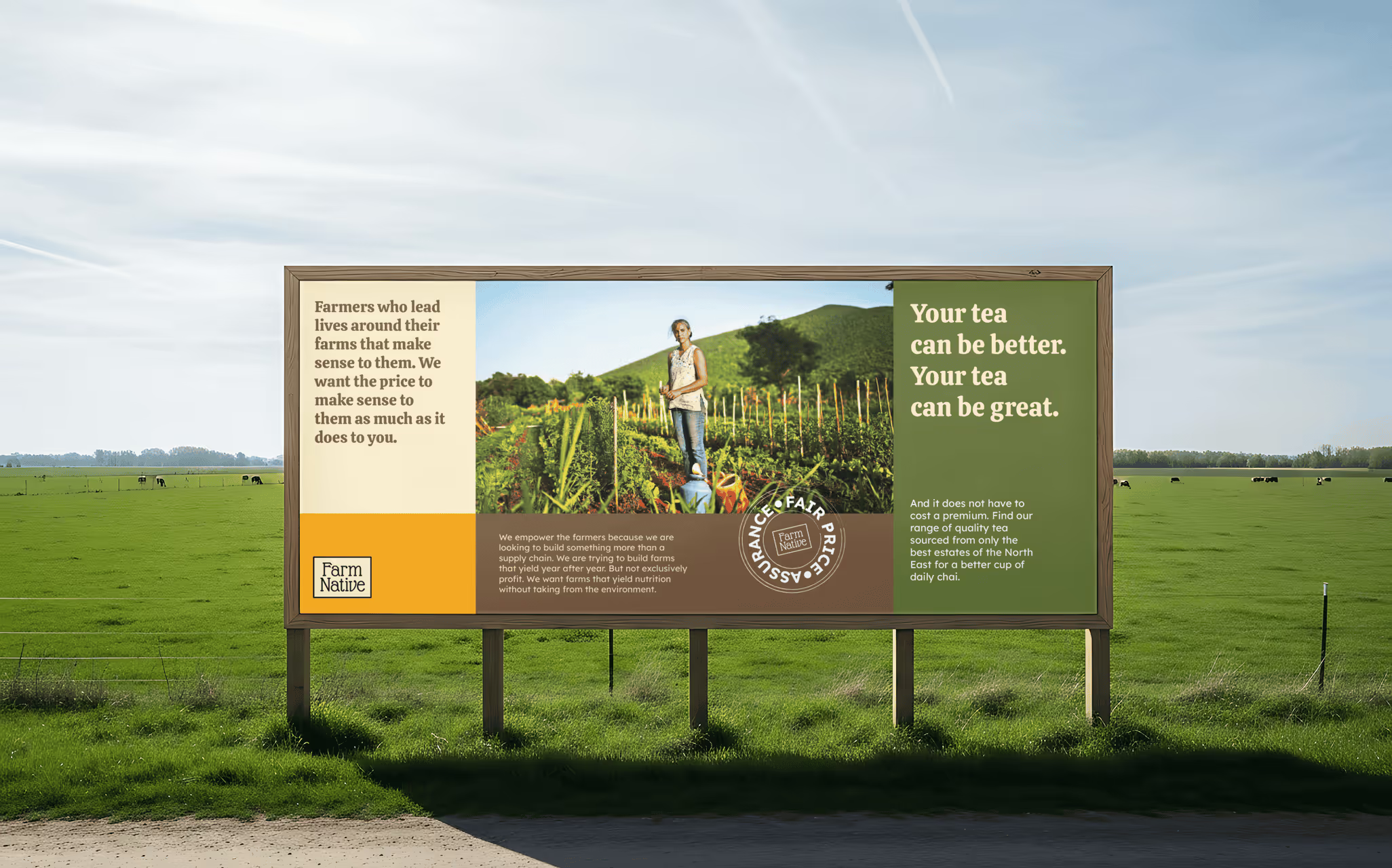
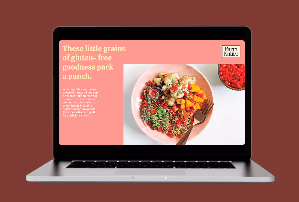
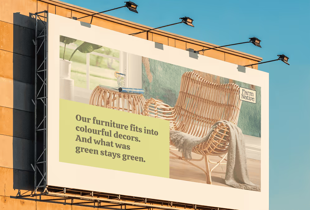
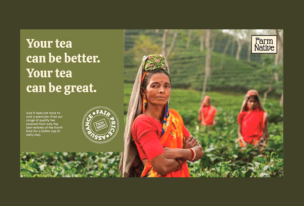
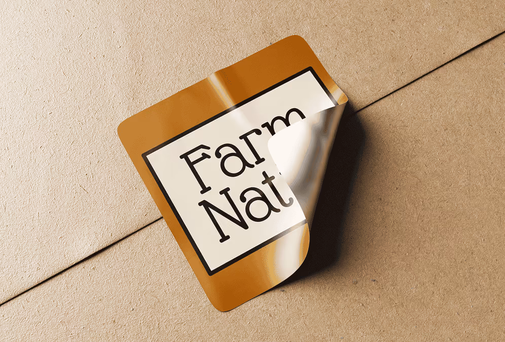
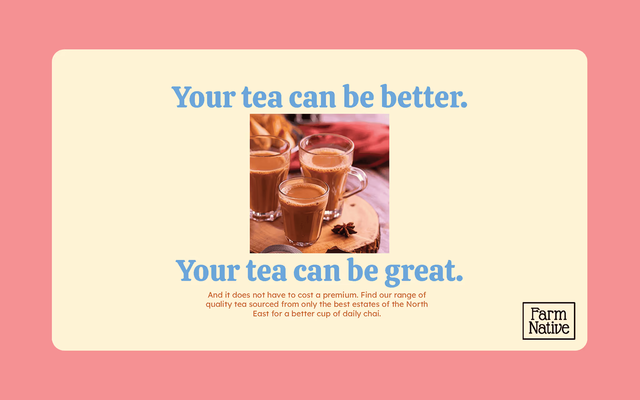
Farm Native Group is an integrated business conglomerate in Eastern India, focused on sustainable agriculture and horticulture—with a wider commitment to quality, social well-being, and philanthropy. They were preparing to launch a new retail brand presence and needed a foundation that would feel credible from day one. We partnered with Farm Native to build that foundation through a complete brand identity and packaging design for a multi-product range—with enough structure in the system to support future additions without reinventing the look each time.

(WORk)
(Concept)

The challenge

Farm Native needed to show up with clarity across two critical moments:

  • First impression: a brand identity that feels trustworthy, grounded, and recognisable
  • Shelf + product reality: packaging that works as a family—consistent enough to build recall, flexible enough to grow

The underlying need was simple: make the brand easy to understand and easy to scale.

Our solution

We treated the identity and packaging as one connected system—not separate deliverables.

That meant creating:

  • a brand toolkit with clear rules (so the brand stays consistent as more people use it), and
  • a packaging approach that can expand cleanly across new SKUs, formats, and future product lines.

What we worked on

  • Complete brand identity
    We defined the visual foundations—logo usage, colour palette, typography, and core brand elements—then documented it in a practical brand guide so the system could be applied consistently across future touchpoints.
  • Packaging for a product family
    We designed packaging for six products, with a structure that keeps the range visually connected while allowing each product to be clearly differentiated. To support growth, we also developed a scalable template approach for future packaging extensions.
  • Launch-ready collateral basics
    The identity system was supported with essential collateral so the brand could operate day to day without visual drift.

Outcome

Farm Native left with a brand foundation that’s clear, cohesive, and built for expansion: a confident identity, packaging that reads as a unified product family, and a system that reduces friction when new products are introduced.

Next step
Want packaging and brand to feel like they came from the same brain? Contact us

(WORk)
(MORE)

Check more work

Get in touch