.svg)

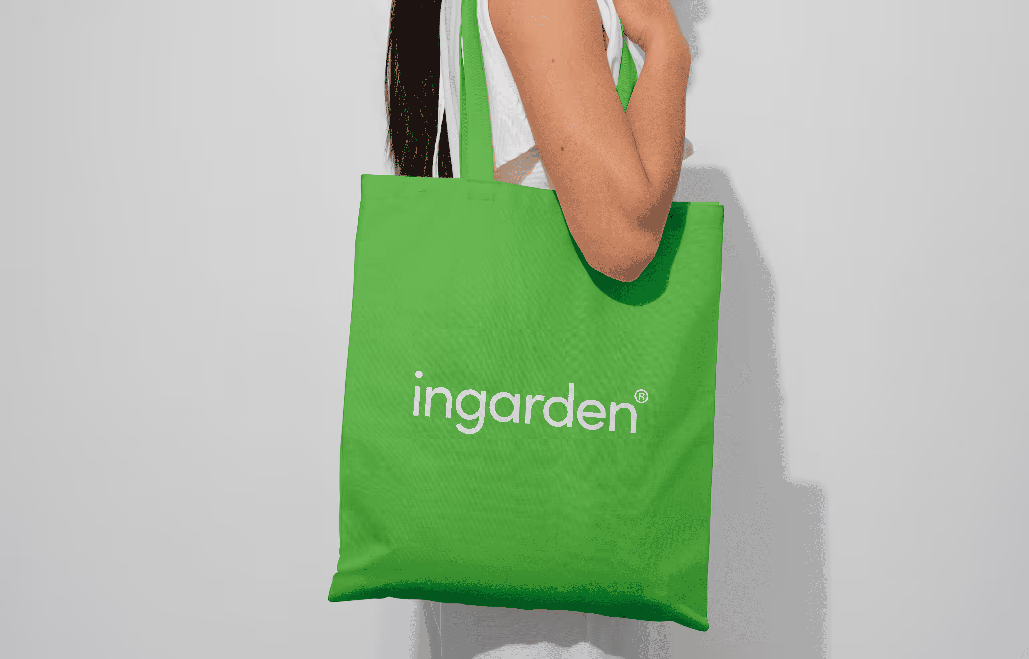
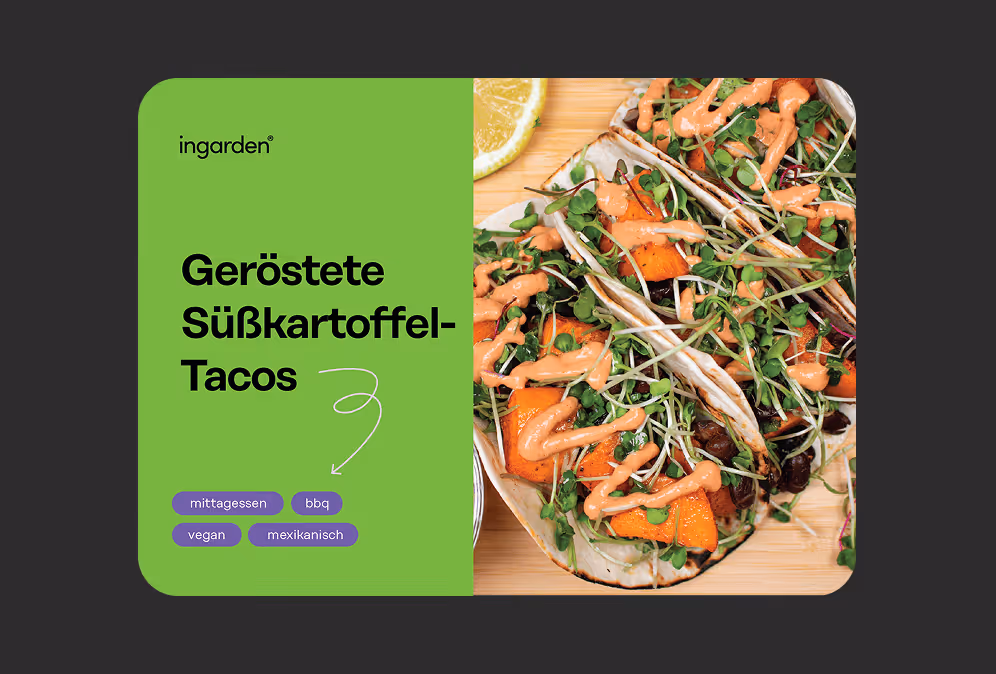
Ingarden offers a nutrient-rich alternative to traditional supplements through microgreens—organically grown, with a growing kit that helps customers grow their own at home. As the business scaled, they didn’t need a one-off redesign. They needed reliable, on-brand design support that could keep pace with marketing, packaging, and product updates. We partnered with Ingarden on a retainer basis to create and refine visual assets—using their existing brand system (fonts, colours, imagery)—so everything customers touched felt consistent, current, and easy to trust.
_Black%201.avif)
When a brand is active across packaging, web, email, retail marketplaces, and partnerships, inconsistency creeps in fast. And when marketing moves quickly, the risk isn’t “bad design”—it’s misalignment:
Ingarden needed a design partner who could jump between formats and priorities—without losing the thread.
A retainer setup built for momentum: monthly graphic design support that keeps brand consistency tight while enabling new marketing initiatives.
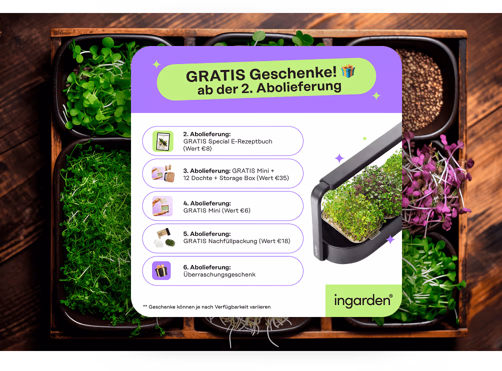
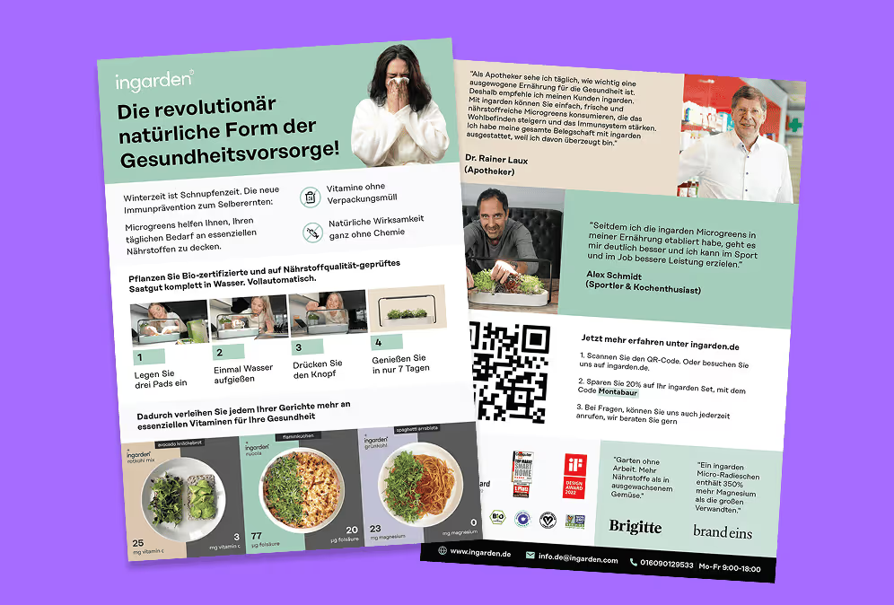
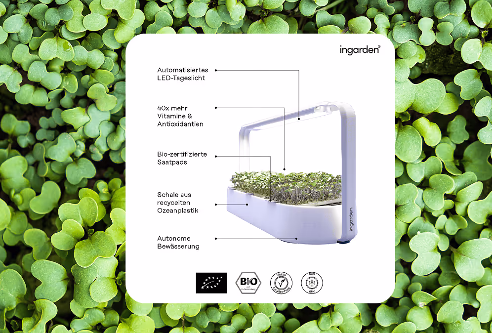
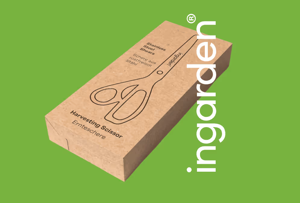
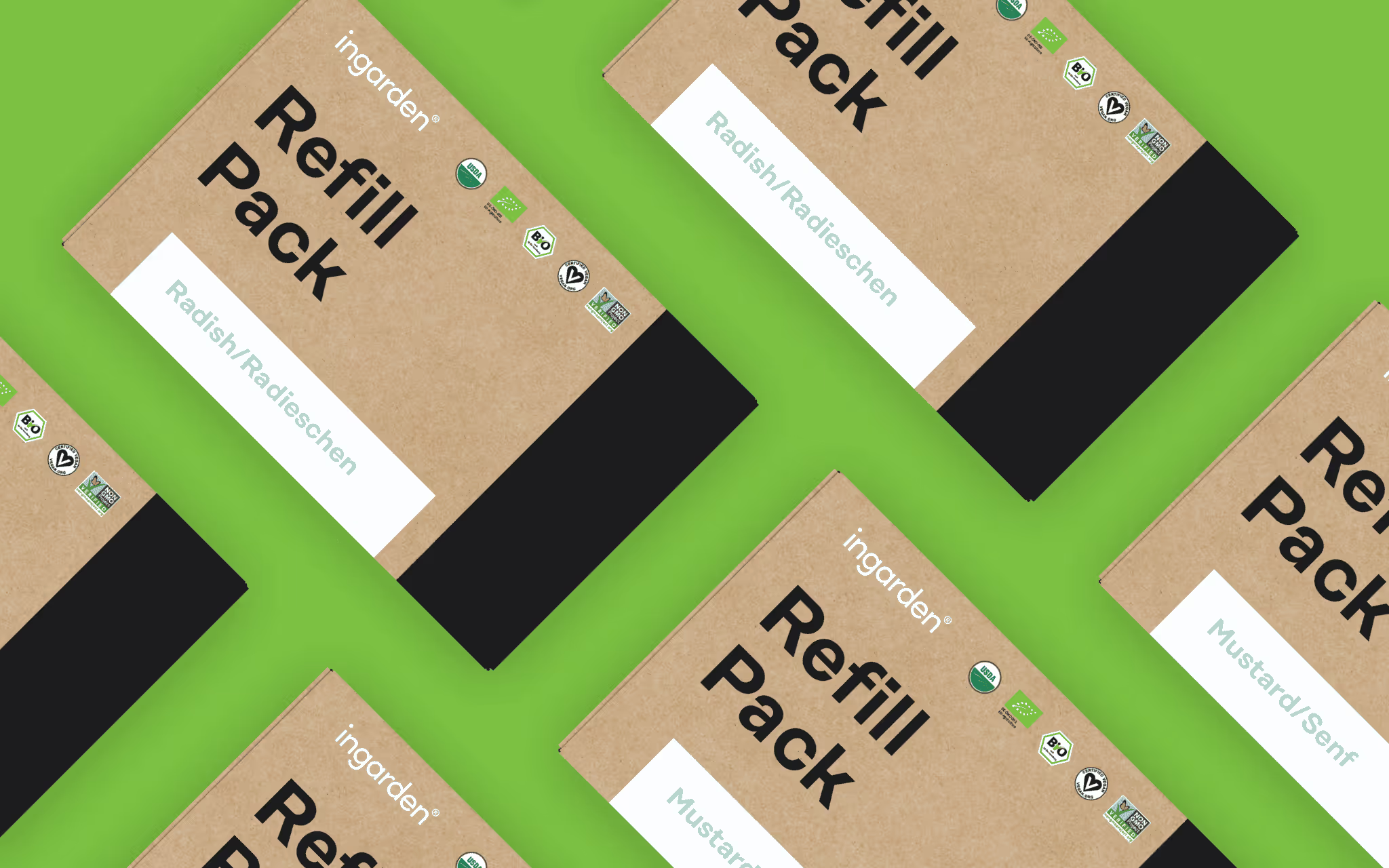
That meant creating production-ready assets (not just concepts), refining details across iterations, and making sure every output matched Ingarden’s established visual language—so customers see one cohesive brand, whether they’re opening a refill pack or scrolling a gallery.
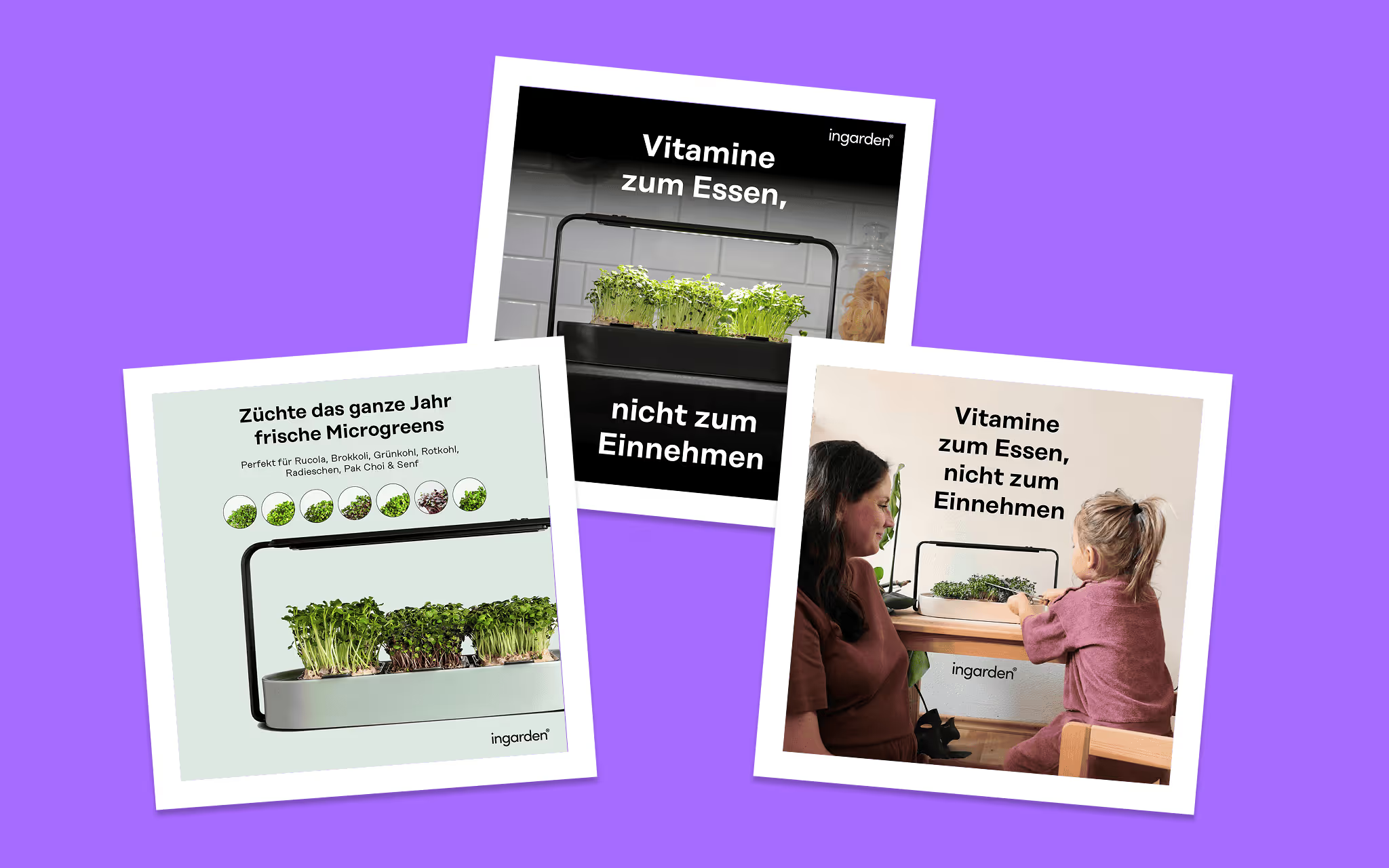
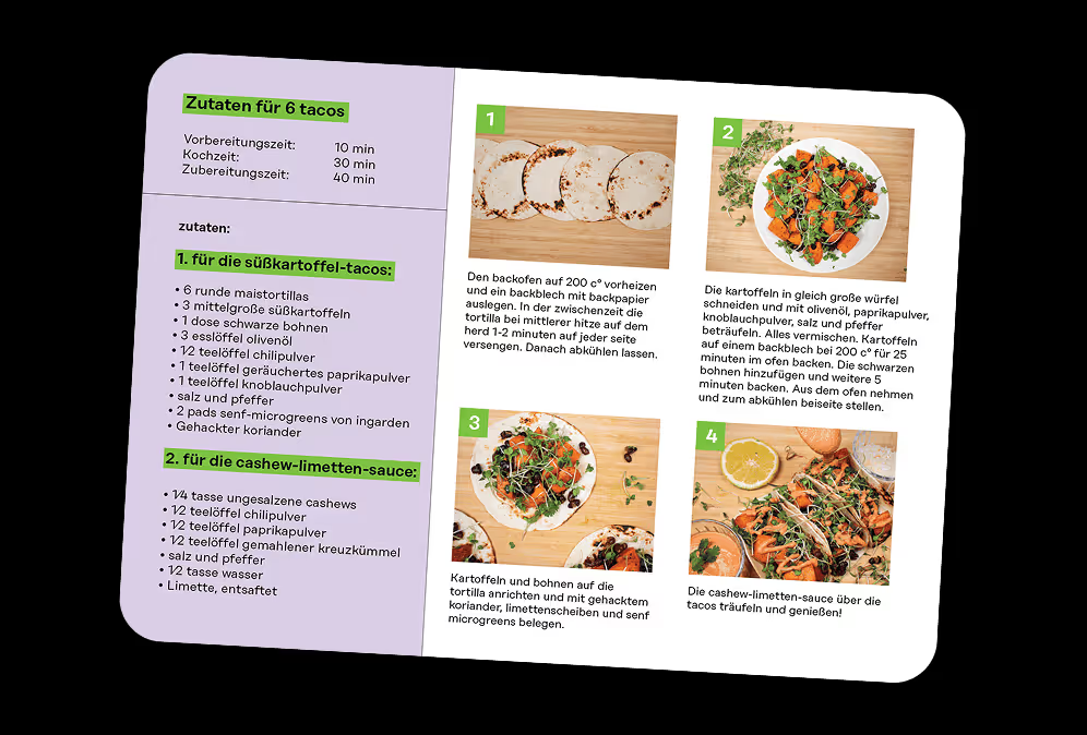
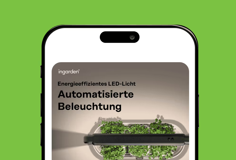
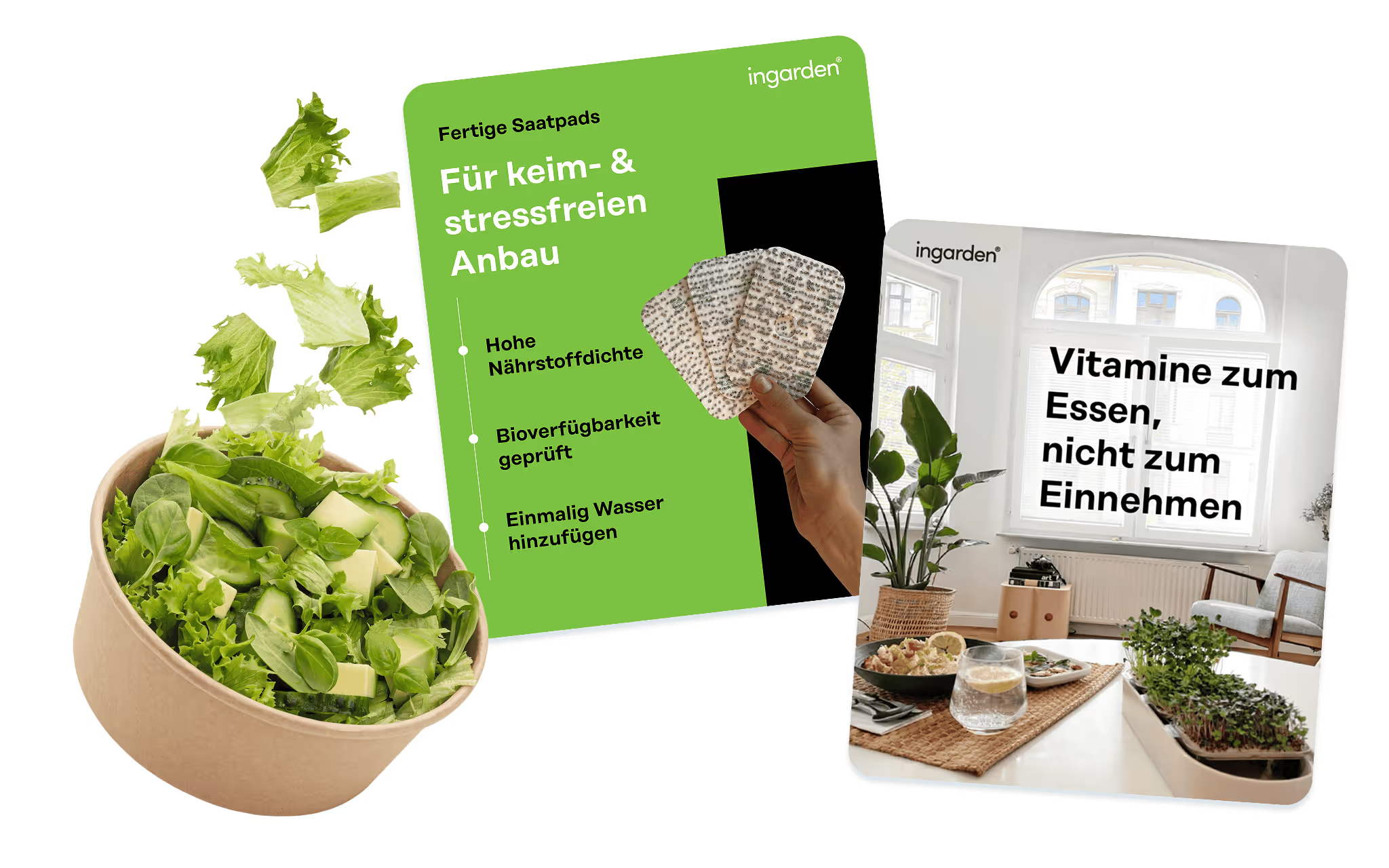
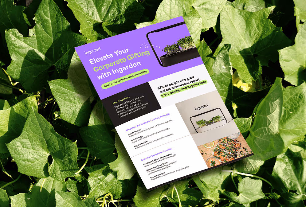
A broad mix of brand application work, spanning physical and digital touchpoints:
Ingarden ended up with a growing library of assets that feel like one brand—because they are. The retainer structure made it easier to move quickly without sacrificing consistency, and helped keep key customer touchpoints (packaging, inserts, guides, web visuals, partnership collateral) aligned as the business evolved.
When a brand is active across packaging, web, email, retail marketplaces, and partnerships, inconsistency creeps in fast. And when marketing moves quickly, the risk isn’t “bad design”—it’s misalignment:
Ingarden needed a design partner who could jump between formats and priorities—without losing the thread.
A retainer setup built for momentum: monthly graphic design support that keeps brand consistency tight while enabling new marketing initiatives.
That meant creating production-ready assets (not just concepts), refining details across iterations, and making sure every output matched Ingarden’s established visual language—so customers see one cohesive brand, whether they’re opening a refill pack or scrolling a gallery.
A broad mix of brand application work, spanning physical and digital touchpoints:
Ingarden ended up with a growing library of assets that feel like one brand—because they are. The retainer structure made it easier to move quickly without sacrificing consistency, and helped keep key customer touchpoints (packaging, inserts, guides, web visuals, partnership collateral) aligned as the business evolved.