.svg)

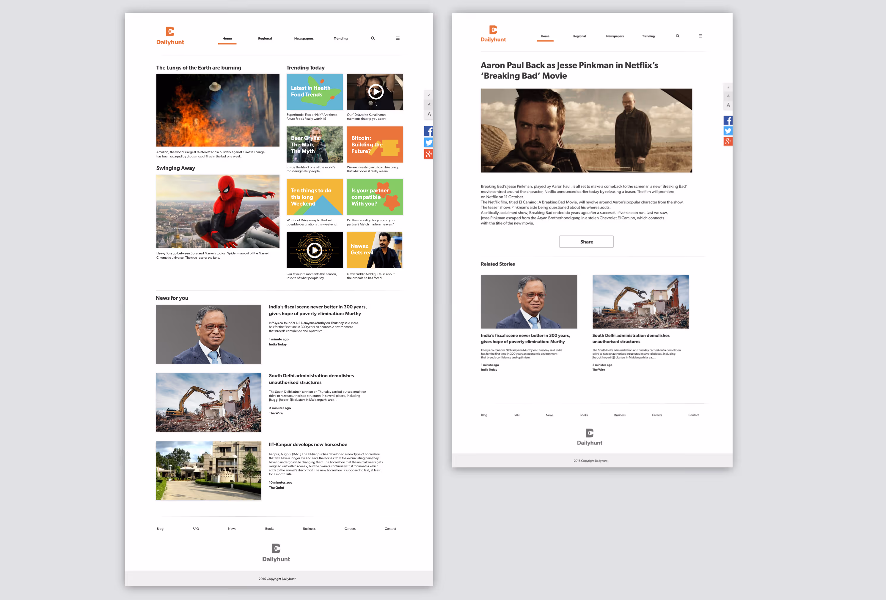
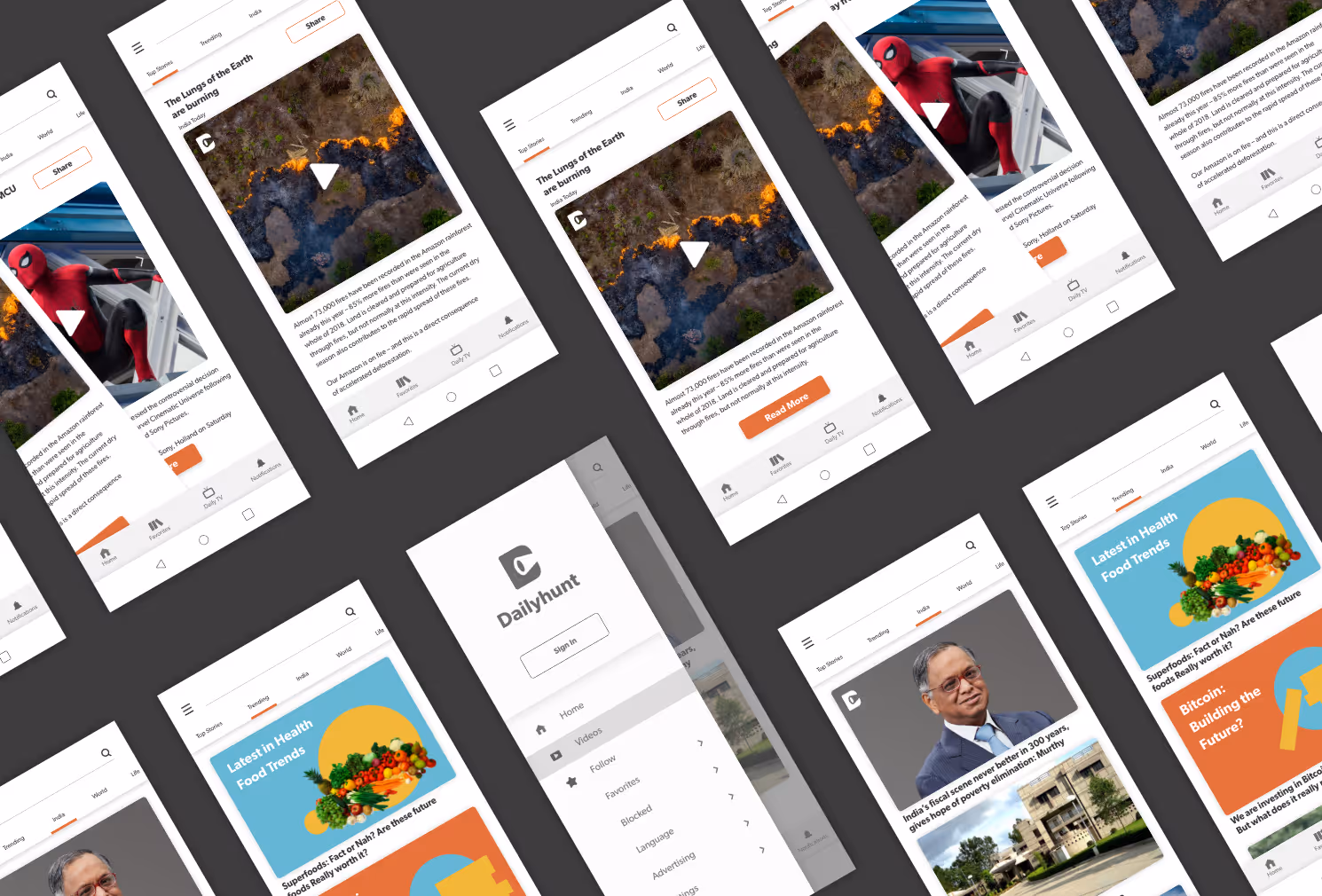
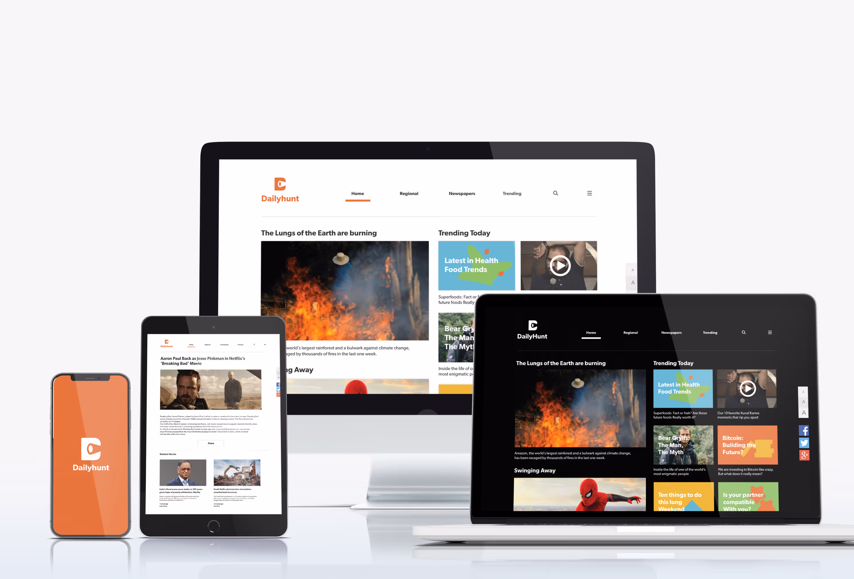
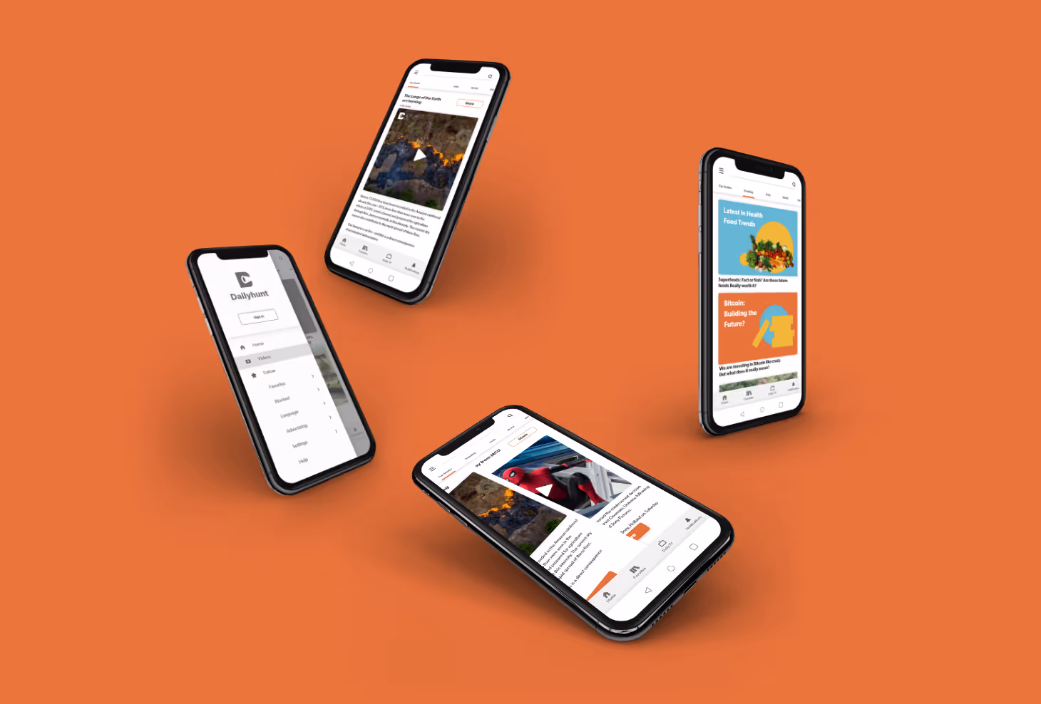
We gave the web application a more modern look and feel and also introduced a dark mode. We wanted to revamp the whole application and web experience of the brand new Dailyhunt newspaper. The system envisioned included illustrated cards from the visual language devised by us to be used in tandem with photographs. The dark mode made it easier for night-time reading, which is a necessary feature for any reading app. The app experience was revamped to be give it a more contemporary look and feel, with swipeable home screen cards for the main articles, the brand colours incorporated seamlessly into the overall experience and giving the whole application a far more cohesive feel.

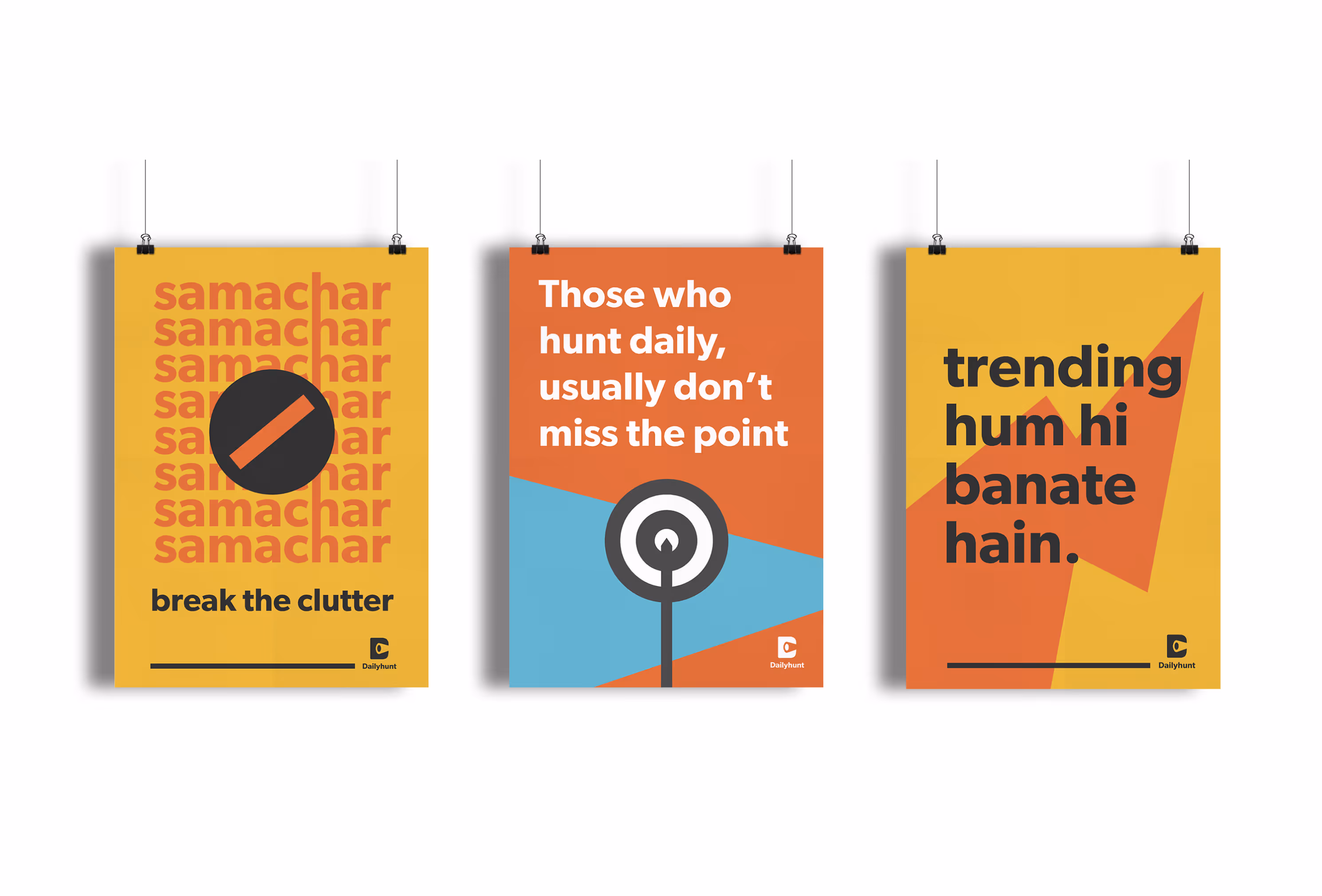
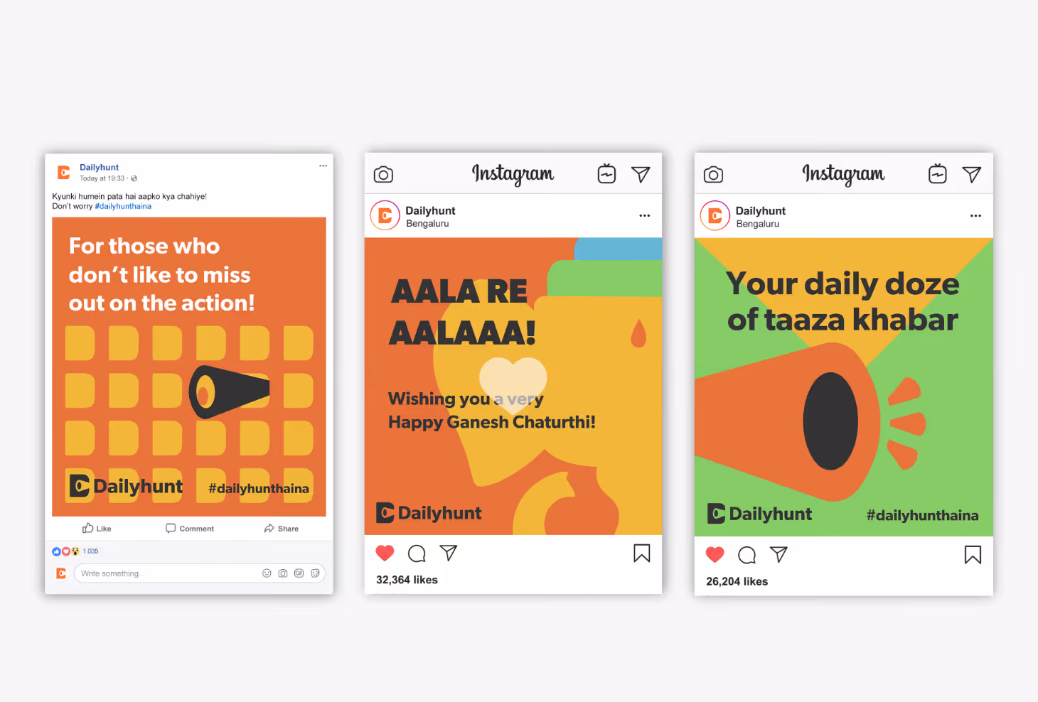
On a mission to bridge the gap between "Bharat" and "India", we gave Dailyhunt a face that is young, confident, techie yet desi, just like the modern Indian youth. Taking inspiration from various forms of news dissemination that have existed across the country over time, be it the communal announcements made in small villages, the traditional delivery of newspaper rolls to residences or the unlimited scrolling within news apps to perhaps just the casual hunt for information, Dailyhunt is a symbolic representation of all in one. It celebrates the past and eagerly awaits the future.
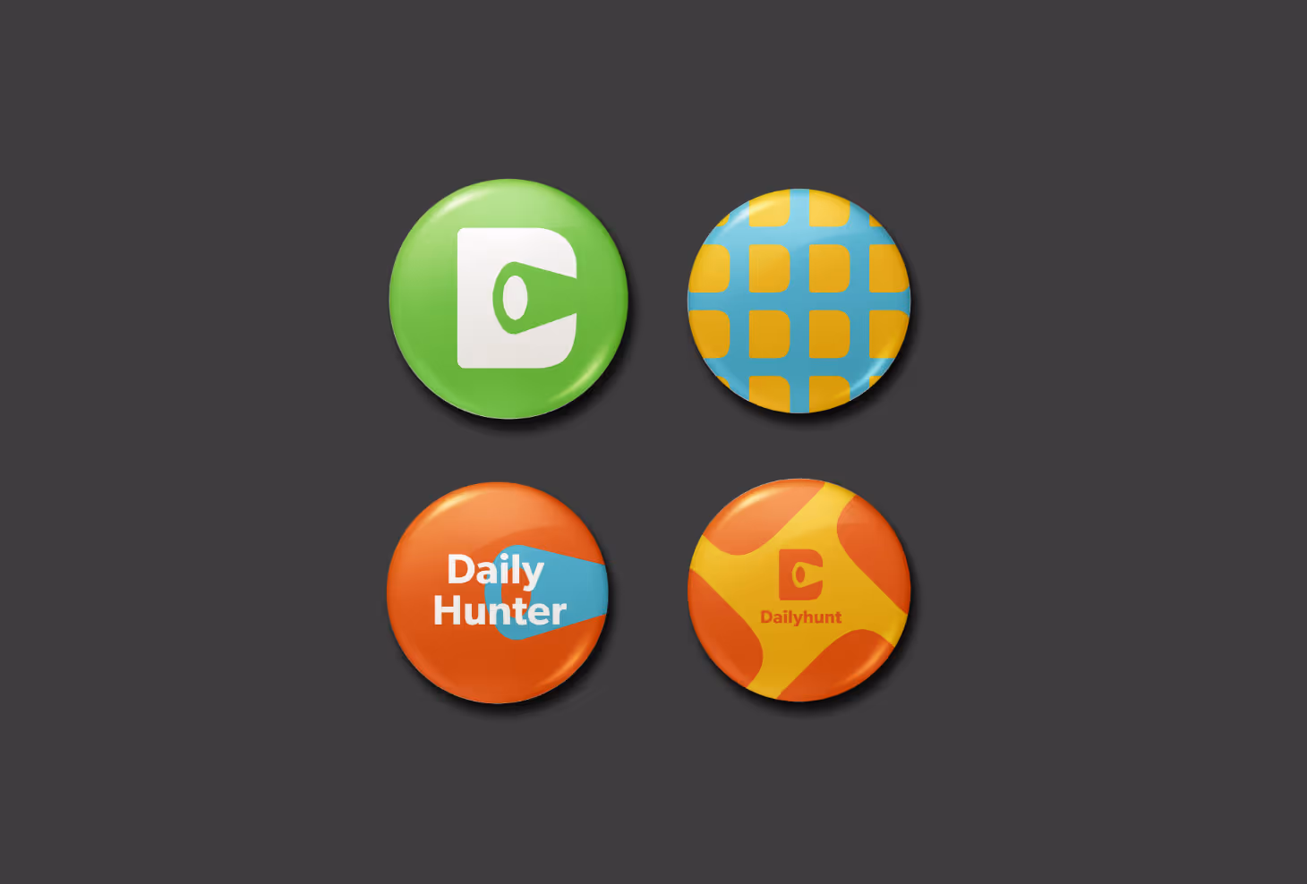
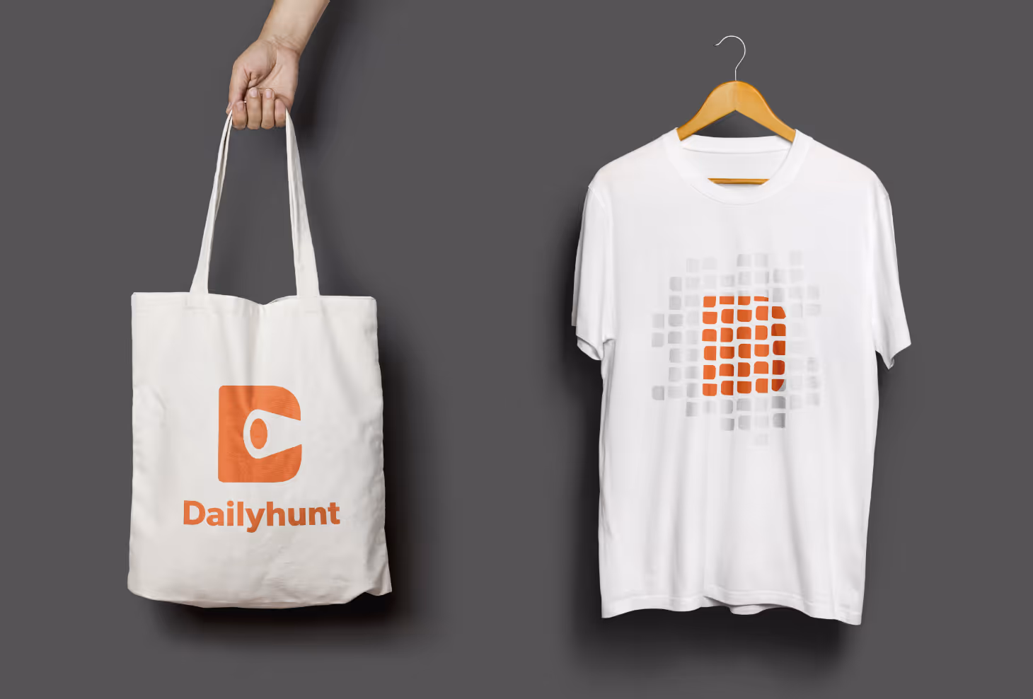
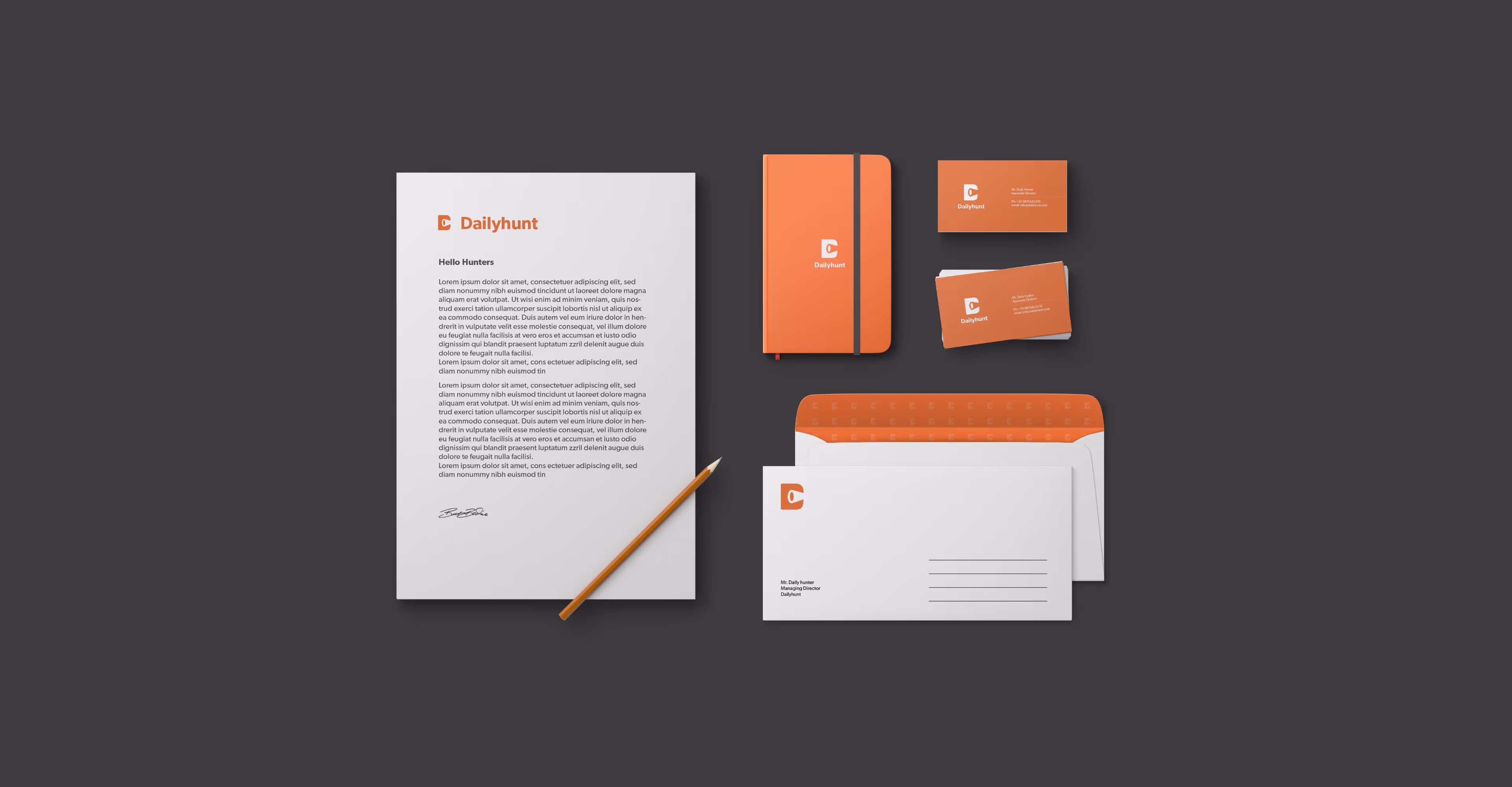
By retaining the original brand colours in our process, we wanted to retain the original brand association among the audience while simultaneously revealing a side of Dailyhunt that goes beyond the plain old.
On a mission to bridge the gap between "Bharat" and "India", we gave Dailyhunt a face that is young, confident, techie yet desi, just like the modern Indian youth. Taking inspiration from various forms of news dissemination that have existed across the country over time, be it the communal announcements made in small villages, the traditional delivery of newspaper rolls to residences or the unlimited scrolling within news apps to perhaps just the casual hunt for information, Dailyhunt is a symbolic representation of all in one. It celebrates the past and eagerly awaits the future.
By retaining the original brand colours in our process, we wanted to retain the original brand association among the audience while simultaneously revealing a side of Dailyhunt that goes beyond the plain old.